The iPhone SE (2020) Review: A Reinvigorated Classic
by Andrei Frumusanu on April 24, 2020 6:30 AM EST- Posted in
- Mobile
- Apple
- Smartphones
- iPhone SE
- Apple A13
- iPhone SE 2020
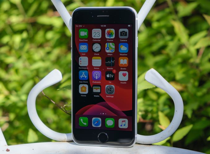
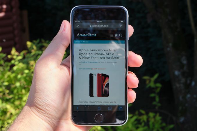
Apple’s latest iPhone SE is being released today, and it’s certainly going to make a big impact on the market, for the simple reason that this is a $399 iPhone. We’ve had the new phone for a mere 24 hours, but we've been able to quickly put the device through its paces, showcasing the biggest differentiating factors for the phone – a device that can be essentially described as an iPhone 8 but with the brains of an iPhone 11.
In that sense, the second-generation iPhone SE is an extremely straightforward device. Externally, there’s very little that exposes it as a 2020 phone, with only the most minute design changes present. Powered by Apple's latest-generation A13 chip however, it’s hiding the strongest internal components in the market right now, easily beating any other device from the competition – at any price point. What’s left to be tested is how the new iPhone SE’s camera holds up, and if there’s any other noticeable differences between it, the iPhone 8, and the iPhone 11 series phones.
| Apple 2019-2020 iPhone Specifications | |||||
| iPhone 11 Pro | iPhone 11 Pro Max | iPhone 11 |
iPhone SE
|
||
| SoC | Apple A13 Bionic 2 × Lightning Performance @ 2.66GHz 8MB L2 4 × Thunder Efficiency @ 1.73GHz 4MB L2 |
||||
| GPU | Apple, 4 Cores | ||||
| DRAM | 4GB LPDDR4X | 3GB LPDDR4X | |||
| Display | 5.8-inch OLED 2436×1125 DCI-P3/True Tone 800 cd/m² brightness 2M:1 contrast ratio |
6.5-inch OLED 2688×1242 DCI-P3/True Tone 800 cd/m² brightness 2M:1 contrast ratio |
6.1-inch LCD 1792×828 DCI-P3/True Tone 625 cd/m² brightness 1400:1 contrast ratio - |
4.7-inch LCD 1334×750 DCI-P3/True Tone 625 cd/m² brightness 1400:1 contrast ratio - |
|
| Size | Height | 144.0 mm | 158.0 mm | 150.9 mm | 138.4 mm |
| Width | 71.4 m | 77.8 mm | 75.7 mm | 67.3 mm | |
| Depth | 8.1 mm | 8.1 mm | 8.3 mm | 7.3 mm | |
| Weight | 188 grams | 226 grams | 194 grams | 148 grams | |
| Battery Life | 3046mAh +14.5% capacity "+4H vs XS" |
3969mAh +25% capacity "+5H vs XS Max" |
3110mAh +5.7% capacity "+1H vs XR" |
1810mAh +0% capacity vs iPhone 8 |
|
| Wireless Charging | Qi | ||||
| Rear Cameras | Main | 12 MP 1.4µm Dual Pixel PD f/1.8, OIS Wide Color Gamut Quad LED True Tone Flash |
12 MP 1.4µm f/1.8, OIS Wide Color Gamut Quad LED True Tone Flash |
||
| Tele- Photo |
12 MP f/2.0 Telephoto, OIS 2x Optical Zoom |
- | - | ||
| Wide | 12MP f/2.4 120° Ultra-wide Angle |
- | |||
| Front Camera | 12MP f/2.2 Wide Angle | 7MP f/2.2 | |||
| Storage | 64 GB 256 GB 512 GB |
64 GB 256 GB 512 GB |
64 GB 128 GB 256 GB |
64 GB 128 GB 256 GB |
|
| I/O | Apple Lightning | ||||
| Wireless (local) | 802.11ax Wi-Fi with MIMO + Bluetooth 5.0 + NFC | ||||
| Cellular | Gigabit-class LTE-A 4x4 MIMO and LAA |
Gigabit-class LTE-A 2x2 MIMO and LAA |
Gigabit-class LTE-A |
||
| Splash, Water, Dust Resistance | IP68 up to 2 meters (Pro models = 4 meters), up to 30 minutes |
IP67 up to 1 meters, up to 30 minutes |
|||
| Dual-SIM | nano-SIM + eSIM | ||||
| Launch Price | 64 GB: $999 / £1049 / 1149€ 256 GB: $1149 / £1199 / 1319€ 512 GB: $1349 / £1399 / 1549€ |
64 GB: $1099 / £1149 / 1249€ 256 GB: $1249 / £1299 / 1419€ 512 GB: $1449 / £1499 / 1649€ |
64 GB: $699 / £729 / 799€ 128 GB: $749 / £779 / 849€ 256 GB: $849 / £879 / 969€ |
64 GB: $399 / £419 / €479 128 GB: $449 / £469 / €529 256 GB: $549 / £569 / €649 |
|
Hardware-wise, the iPhone SE is anything but a budget or middle-range phone. Being powered by Apple’s A13 SoC, the company didn't spare any expense by going for a previous generation chipset, and rather used the latest and greatest they had available. What this means is that performance-wise, the new iPhone SE essentially should be on par with the iPhone 11 series – which in turn means that alongside its siblings, the new SE will be the most powerful mobile phone on the market right now.
As to why Apple chose to do this, I think it’s just a simple matter of projected longevity of the phone. Apple might not be producing previous generation A-series chipsets for much longer whereas the iPhone SE is a new product that will need to be supported (and likely to be produced) for several years into the future. Choosing the A13 here might not be the cheapest option at the very beginning of the phone’s lifetime, but it’s certainly going to pay off long-term when it comes to production as well as support.
Apple gives the iPhone SE 3GB of LPDDR4X RAM – one less GB than the iPhone 11 series, but still significantly more than past iterations of iPhones. Other internal component upgrades are the new cellular modem which is on par with the iPhone 11 series, and the new WiFi 6 combo chip that now also provides Bluetooth 5.0 connectivity.
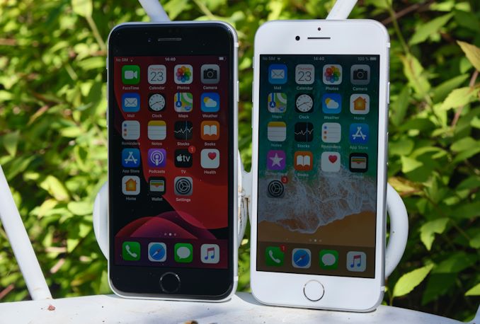
While I generally prefer black front bezels on smartphones, it’s a so-so choice for the iPhone SE. On one hand it focuses you more on the screen content, however the black is also a lot more a finger-print magnet, and I did think the white iPhone 8 looked quite nice as it was. Holding both phones side-by-side, the back front does feel “older” and less modern than the white variant. I guess it’s a matter of preference.
As for the display, the only difference between the 4.7-inch iPhone SE and the iPhone 8’s own 4.7-inch, 1334 x 750 resolution IPS LCD is the fact that the new screen lacks 3D Touch. Instead, Apple is favoring the new long-press haptics that were introduced in the iPhone 11 series.
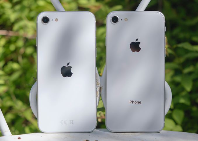
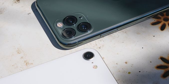
From the back, there’s also some very slight design changes. First of all, the new logo is centered, and the “iPhone” marking is gone, compared to the iPhone 8’s back glass design.
Interestingly, the new white design is actually significantly whiter than the iPhone 8’s white on the back glass, it now matches the brighter tone that was previously found on the front bezels. It does allow the white to pop out a lot more and I do prefer this shade.
The only other minuscule difference between the two phones is the fact that the back microphone and bottom speaker’s black mesh has been replaced with a silver one, more closely matching the white theme of the phone.
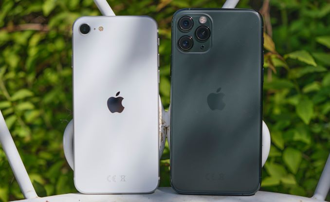
Size-wise, compared to contemporary phones, the iPhone SE has an outright diminutive stature. Compared to the iPhone X/XS/11 Pro body, which for the last two years has been Apple’s smallest form-factor device, the iPhone SE feels tiny, not only in its dimensions, but also in terms of weight.
The weight difference however does come with one big caveat: the iPhone SE shares the same battery as the iPhone 8, meaning it comes in at a tiny 1810mAh. That’s a huge disadvantage compared to the bigger capacities of the new iPhone 11 series phones, but the iPhone SE is also sporting a very small and very efficient display panel. Apple claims battery life is in line with the iPhone 8 – a claim we’ll verify later in the mini-review.
Overall, it’s been refreshing to use a smaller form-factor phone these days. I have no doubts that a very large part of the potential buyers of the iPhone SE will be those that just aren’t willing to switch to the bigger and heftier devices that have become the norm in the last few years. It’s a dying breed of phones, and the iPhone SE here no doubt is catering both for nostalgia and smaller-form-factor market.
Camera-wise, that’s where we’ll be seeing some quite larger differences between the new iPhone SE and its contemporary siblings. Whilst the A13 and its new ISP will be no doubt upgrading the image processing abilities of the phone, its hardware is still only similar to that of the iPhone 8. Apple here uses the same generation sensor, which means it’s significantly smaller than what’s found on the iPhone 11’s – and of course there’s only one module. We did some quick camera testing and found some differences to the iPhone 8’s capturing ability – some positive but also some negatives, read more in the later section.
Overall, the iPhone SE is taking the physical formula that should be well tested and proven by almost 500 million users out there. It’s certainly not a modern-looking phone, but it remains unique in the market today due to its size and light weight.




196 Comments
View All Comments
ingwe - Friday, April 24, 2020 - link
Very impressed overall. Glad Apple finally released something at this price range again. Time to upgrade from my SE.haukionkannel - Friday, April 24, 2020 - link
I agree, very impressive indeed! This makes most other middle range phones look really bad in comparison!linuxgeex - Friday, April 24, 2020 - link
Hopefully Sandcastle will get to a point where we can install Android 11 on this and end up with a phone we can actually customise and install the software of our choice on vs the limited Apple ecosystem. And I'd love to see whether the Geekbench numbers hold up when running on Android, so we can see whether/how much Apple has been cheating on that benchmark ;-)mrochester - Saturday, April 25, 2020 - link
Why would you want to ruin an iPhone by putting android on it? The whole reason the iPhone is so popular is because it’s NOT android!Oxford Guy - Saturday, April 25, 2020 - link
The last time I tried Android it was so bad I returned the phone.But, iOS is seriously annoying in some ways — like how it spams you with random pop-ups telling you that you can turn on location tracking.
Well, if you choose "Ok" to dismiss the pop-up it turns on location tracking. The only other option you're given is "Open Settings". How many conventions does the pop-up violate?
1) Totally modal? Check.
2) No way to close the window without choosing from bad options? Check.
3) Comes up without any prompting/relevance? Check.
4) Behaves in a way that's user-hostile? Check
5) Behaves in multiple ways that are user-hostile? Check.
6) Violates expected UI conventions ("Ok" to dismiss)? Check.
Of course, one should expect that location tracking is still enabled even if it's "off".
One of the things I always find amusing is how my car always knows I have an iPhone because it's broadcasting Bluetooth even when Bluetooth is "turned off".
Oxford Guy - Saturday, April 25, 2020 - link
7) Gives you two laborious options instead of a simple/efficient option? Check.8) Makes it seem like one option is laborious but the other is simple (deception)? Check.
yeeeeman - Saturday, April 25, 2020 - link
Last time you probably tried android was version 2.0. Now we're at version 10. Try it again.Oxford Guy - Sunday, April 26, 2020 - link
"Last time you probably tried android was version 2.0. Now we're at version 10. Try it again."I tried it before I purchased an iPhone 8.
(Given JCheng's comment, Apple may have changed the behavior of the pop-up between iOS 12 and the most recent, which I believe is 13. I am still using 12 for the moment, despite Apple's harassment over that which is another topic.)
RSAUser - Sunday, April 26, 2020 - link
Android 7? That's quite a while ago, missing a lot of newer things, I'm on 10 currently.Android 8 introduced:
- Project Treble (updates are way faster now due to modularization, I get an update every month)
- Adaptive icons (theming, circle, square, rounded, etc.)
- Notification improvements (channels (grouping), badges, snooze, multi-colors)
- System-wide autofill
- Can limit app background activity and location checks
- Color management for display
- 8.1 onward: Neural networks API, sahred memory API, Bluetooth battery level for connected devices, auto light and dark themes
Android 9:
- Screenshot option to lock menu
- Lockdown mode
- Notifications are "rich", can include images, smart replies, etc.
- Volume slider change (the two bars, that can also pop out to be all media controls without having to go to all the settings)
- Pill gesture system (I kind of still prefer this to the Android 10 gestures, a bit torn)
- "Shush", mute standard notifications if phone is face down
- Adaptive battery (way better hibernation, my phone lasts me two days easy with 7/8 hours screen on)
- Auto brightness based on habits (I think I adjust brightness maybe once a month or so, usually if watching a super dark video)
Android 10:
- New permissions system for once off only, only if shown, etc
- Background apps can't jump to foreground
- AV1 codec support (Netflix uses way less data and space.)
- System-wide dark theme
- New gesture navigation
- Project Mainline: Core OS components updated via google play store, no more restart for those updates or reliant on manufacturer and carrier to approve.
I'm still wondering what Android 11 will bring, since Android 10 is really well fleshed out now, the next couple of updates will be minor things, same for iOS. Only recently used iOS again since ~10, 13 is actually pretty nice, just a little annoyed by how difficult it is to easily connect to specific BT devices, Android still has better pop-up imho, though really happy iOS finally introduced it.
Best thing would have been if iOS left both old and new gestures in, with toggle options for which you want, ah well.
flyingpants265 - Friday, May 8, 2020 - link
I mean.. almost everything in that list is crap.-Keyboard still lags when popping up, when it should be the fastest feature on the entire phone. It's about 5x slower than it should be (I measured against other UI movements)
-App-switching is laggy on every phone.
-App-switcher (Recents) is still UNORDERED EVERY SINGLE TIME, no options to configure this. Each iteration of Recent apps is worse.
-Most of the software takes up way more memory/CPU than it should.
-Most of the apps have very bad UI, lots of clicking through menus and going "back" with the wonky back button, it's truly an adventure.
-Multi-window is useless. We've had widgets for 10+ years (also useless), but nobody thought to put widgets inside multi-window so you can do multiple things from the same screen.
-Can't do basic things like switch between different multi-window panes that are already set up (app1+app2 to app3+app4). Think "multi desktop".
-Can't do basic things like configure swiping left/right between different apps, i.e, I'm in Discord, I swipe left to go to WhatsApp. I swipe right to go to Skype. When I first heard about/saw Android, I saw the "swiping screens around" thing and I was blown away. Turns out, all you can do is swipe between your fucking multiple home screens.
-The battery usage window has EVEN FEWER details, it's actually gotten worse over time, so I can't even really see where 8AM is in the graph.
-Still no way to manually re-order/sticky your notifications in the list, therefore, you'll never develop muscle memory for the notification list.
Doing a simple task like finding an image online, downloading it, cropping it, uploading it to imgur, getting the link, and sharing it to a friend.. takes a full minute, when using Gyazo on a PC takes 6 seconds. I have timed it. On the Android phone, most of the time, you are waiting for lag.. apps to switch, features to load.. then clicking through awful UIs. Somehow, nobody ever thought to just make the software work properly? What happened? Everything worked fine on my Pentium 3. Even Atom can do multi-window, multi-tasking, with full windows apps (not crippled Android apps). Seriously, what happened? Did we all just forget how to write computer programs?
I am usually refuted by saying "Oh yeah, well MY device isn't bad.. MY device isn't slow..." That's because you are not using it properly. Try doing multiple things very quickly, and you will be slowed down by the bad UI/apps/OS, even on the latest flagship phones.
I know what the problem is. People are just content to use what they've got, instead of thinking carefully, and creating a vision of how an ideal phone OS "should" work. It's a form of collective brainwashing, and lack of initiative/creativity. It's really that simple. Fix all these problems first, and make the phones unbreakable/easily repairable, and finally THEN, maybe we can talk about paying $999 for a phone.
iOS is even worse.