Samsung’s 5G Smartphone Prototype: Don’t Mention The Notch
by Ian Cutress on December 12, 2018 12:00 PM EST- Posted in
- Smartphones
- Samsung
- Mobile
- 5G
- Snapdragon 855
- Qualcomm Summit 2018

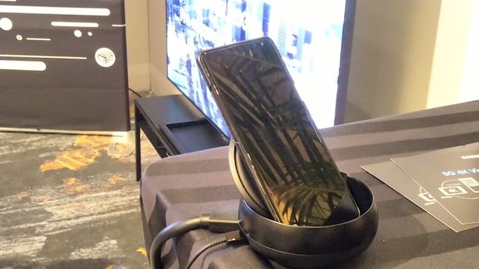
In the Verizon 5G demo area at Qualcomm's recent Snapdragon tech summit, there was a station that was streaming 4K video through a 5G smartphone. That device was a Samsung prototype, and it was kept very hush-hush. They were serious: a completely dark screen and a thick case so none of the discernable details could ‘leak’.
The demo itself was fairly non-descript: a test case in pure bandwidth streaming. Everyone was more interested in the device. All that the Samsung representative would do is slightly drag down the notification bar, so users could verify it was connected to ‘5G UWB’ for the streaming rather than 4G.
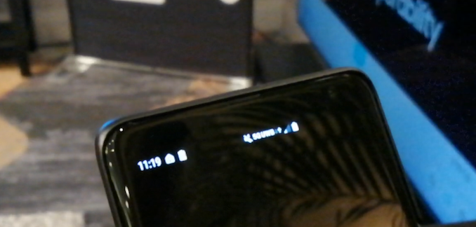
Of course, with fancy angles and photography equipment, a bit more was able to be seen. One of the initial aspects was the fact that there was no regular notch: that much was easily visible from the naked eye and the demo being done. However on closer inspection, the right hand side icons in the notification bar were shifted. This is because there seems to be a notch on the corner.
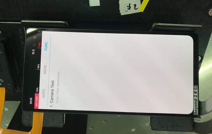
In this photo on Slashgear, it shows the corner notch in all its glory. There’s a front facing camera there, what looks like a speaker/light sensor, and the corner of that notch looks like a hard right angle.
The device on display certainly looked like it has more of an edge to it. We suspect that the hardware in this unit was the Snapdragon 855 and the X50 modem, given the fact that it was a Qualcomm event, and the size of the demo unit was very similar to current Samsung flagships. No mention of any specifications however, as you might imagine. No word on if Samsung will do a similar non-X50 version, however Mobile World Congress is at the end of February when Samsung usually announces its next generation smartphone. We’ll be there, so stay tuned for our coverage.


27 Comments
View All Comments
imaheadcase - Wednesday, December 12, 2018 - link
I won't mention the notch, because i don't care about it, or anyone else will after using a phone with one for awhile.PaoDeTech - Wednesday, December 12, 2018 - link
Yep. A fashion statement as useful as wipers on sunglasses.zanon - Wednesday, December 12, 2018 - link
You've got it backwards, it's the non-notch phones that are the fashion statements. Notches are for the practical, people who care about functionality first and foremost. Of course like most fashion statements non-notch is way overhyped and most people being practical don't care in real use.JoeyJoJo123 - Wednesday, December 12, 2018 - link
There's nothing remotely functional with having to rewrite your app to take into account of all the different notch sizes/locations from phone manufacturers on the market. Having an extra 20 pixels of notification space really doesn't matter that much.It's really is just a lot more rational and reasonable to just continue using square (non-notch) displays so that end-users don't have bad customer experiences with your phone due to notch problems. Even Google's own flagship pixel 3 phones had notch issues on official google apps at launch. Their own phone with their own in-house software didn't play nicely.
Notches are a joke. People want a phone that works, nobody's crying about having an extra bit of screen around the front-facing camera.
name99 - Wednesday, December 12, 2018 - link
I can't speak to the Android side. But until you have used an iPhone with FaceID, you cannot imagine how delightful it is. Even seeing it used by someone else doesn't really give the full impression.And the visuals of the notch --- fades out of your consciousness in less than a day.
It's a tradeoff that's ABSOLUTELY worth it.
SleepyFE - Friday, December 14, 2018 - link
Now that's just too much!! What does FaceID have to do with the notch? I am glad you are happy with giving apple your fingerprints and now your face as well, but that is neither here nor there. Much like your comment. I am also glad you trained yourself to ignore every flaw Apple puts into their products and redirect to ID stealing tech they use (for your convenience of course).If you still use your computer you might have camera integrated in the monitor. Now put your taskbar or tray on top and cover the central third of it with thickly folded paper so you can't see through it. ISN'T THAT GREAT?!? You are welcome. Enjoy.
PeachNCream - Wednesday, December 12, 2018 - link
I came to this article just to read irate, irrational comments about something as unimportant as whether or not a phone has notch or not and was not disappointed.JoeyJoJo123 - Wednesday, December 12, 2018 - link
Except that:1) I wasn't irate. Defined as i·rate: feeling or characterized by great anger. First paragraph I explain that for app developers, it's not functional to have to write what is essentially a case statement for adjusting UI elements, such as a title bar, to accommodate varying notch sizes on phones. Then in the second paragraph I assert that even common end-users would be more familiarized and have a more consistent UX by using phones with square displays, even citing that Google's Pixel 3 line had improper support in Google apps due to their notch design choice. In the third paragraph I just conclude the feature as a joke.
2) I wasn't irrational. I made a claim, and supported my claim. Literally just Google "Pixel 3 Notch", and the front page is filled with results on how to hide it, granting credence that Google's indexing engine is pushing up page results people are clicking on how to hide the notch; that people cared so little about a few extra pixels of screen real estate to the left and right of the camera that they'd rather use software to hide it.
Leave it to PeachNCream to make the crappiest posts on AnandTech comment articles, yet again.
Quantumz0d - Wednesday, December 12, 2018 - link
Google not only screwed with their own iPixel. But dumped the whole Android with the extra unwanted padding to the status bar icons, on the square phones, the icons are more towards the middle leaving space to the corners, for absolutely no reason on Oreo.https://issuetracker.google.com/issues/68351444
Adding salt to the injury they retarded the number of icons as well to dots, making only 4 as usable, for the custom skins like Samsung GraceUI/Touchwiz whatever. They have options to show the notifications more on Pie.
https://issuetracker.google.com/issues/112456377
Since people are ready to drink any kool-aid like Apple apologists, we can never have good experience or control.
Notch and the rounded fad aren't going to go anytime soon unfortunately, the uber tall meaning less displays are another stupid thing. The camera sensors take photographs in 16:9 or 4:3 ofc you can manually tweak to the phone but no sane DSLR will do that weird arse aspect ratio.
It's a huge mess that Apple made, a shame that Samsung's latest phones are going to be 19:9, the only phone which has fairly good footprint and screen is LG V30, their design was on spot despite the tall ratio it's the widest of all the latest 18:9 phones and less taller. But LG dumped it, due to multitude of reasons - Mobile division didn't get profits reason is due to marketing PR team but engg team apparently paid for the price and lost their direction add the presidential changes at LG due to same, now look at the V40 ads "What it takes to switch to V40 - 5 cameras"
So apparently cameras are new fad as well, S10 and whatever + version is having 4 cameras on back and 2 holes in the front,
It's not Infinity O, It's HOLED.
PeachNCream - Thursday, December 13, 2018 - link
You seem sensitive to being called out Joey, yet also neglect to notice that you attempted to do the same thing in another news article recently. Can you not take what you attempt to dish out?